Please NO!
Our colors are maroon and white. Adding grey(the ugliest and boring choice imo). Please not the worn out look of black. This adding third colors is most likely a fad, which I believe like all fads will lose its appeal. Maroon and white looks so clean and collegiate.
As far as the logo, I hate that we have fallen to political correctness with the Colonel. The old guy we had was fine, but if we aren’t going to use a Colonel mascot, or if are, the current one can go. Pioneers? Again a no for me, That’s Transylvania U’s mascot I believe.
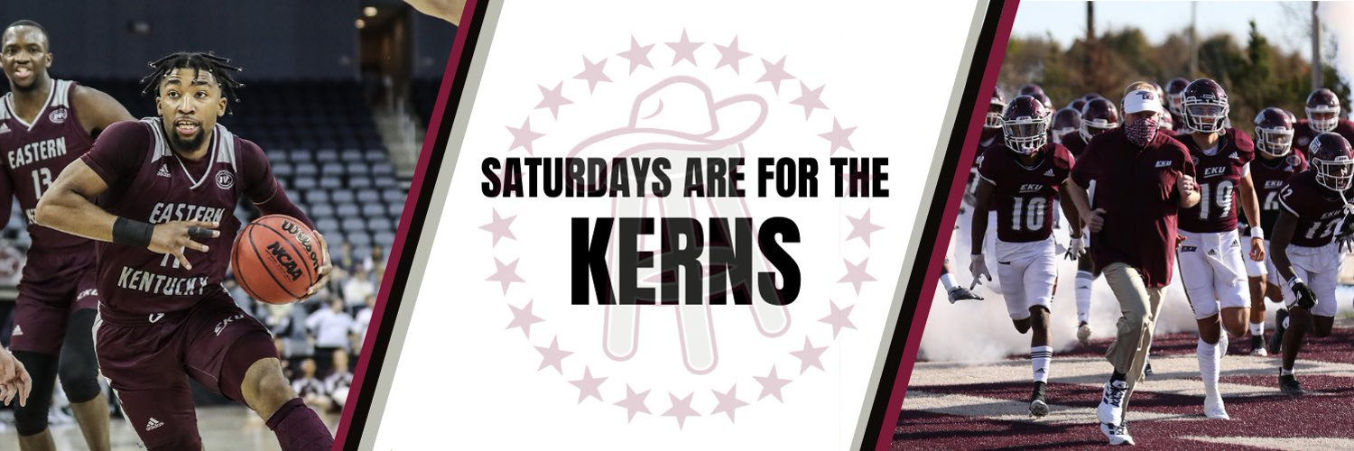
The EKU logo we have now is small, skinny and has little or no appeal and appears weak. . If we are only going to use EKU, at least the stronger font EKU with pride strips is a better look and one that’s been used for quite some time and is recognizable. It certainly looks better than the one used now.
That’s something to be said for tradition and recognition. Changing it every ten years certainly provides no evidence of tradition nor pride.
Look at UK’s interlocking collsgiate font, Ohio States O with a buckeye, UT’s large T. We need something that defines us, looks good and stick to it. But, I think the current skinny forward leaning EKU should go!
Random off season topic

Re: Random off season topic
So you don't like the EKU Pride Stripes look from the Roy Kidd era.ColonelFan22 wrote: ↑Thu Feb 22, 2024 12:54 pm Please NO!
Our colors are maroon and white. Adding grey(the ugliest and boring choice imo). Please not the worn out look of black. This adding third colors is most likely a fad, which I believe like all fads will lose its appeal. Maroon and white looks so clean and collegiate.
As far as the logo, I hate that we have fallen to political correctness with the Colonel. The old guy we had was fine, but if we aren’t going to use a Colonel mascot, or if are, the current one can go. Pioneers? Again a no for me, That’s Transylvania U’s mascot I believe.
The EKU logo we have now is small, skinny and has little or no appeal and appears weak. . If we are only going to use EKU, at least the stronger font EKU with pride strips is a better look and one that’s been used for quite some time and is recognizable. It certainly looks better than the one used now.
That’s something to be said for tradition and recognition. Changing it every ten years certainly provides no evidence of tradition nor pride.
Look at UK’s interlocking collsgiate font, Ohio States O with a buckeye, UT’s large T. We need something that defines us, looks good and stick to it. But, I think the current skinny forward leaning EKU should go!
-
ColonelFan22
- Posts: 86
- Joined: Sun Aug 28, 2022 10:56 am
Re: Random off season topic
Yes. That’s the logo I suggested we use. The EKU pride strips Coach Kidd used. It was on helmets this year and looked great.
I do not like the current forward, skinny EKU with the one slash. It looks weak, that seems to always be our logo on TV, not notable whatsoever.
Just my opinion, but this year’s football uniforms were the best looking in years.
As I said before, there’s something to be said for tradition instead of chasing the next fad that every high school team adapts.
Re: Random off season topic
It is, but by doing that I was suggesting the connection to the on-campus statue of Daniel Boone (but with a female counterpart). But my guess is they'd rather steer clear of human depictions altogether anyway. It's not like it would be the first time we stole something. Centre was called the Colonels *long* before we were.Pioneers? Again a no for me, That’s Transylvania U’s mascot I believe.
I don't think as many schools are adding new colors as you think. A few have gotten a little wacky, but in the case of Ole Miss that was mentioned it's more of a throw back to a shade they used in a previous era. A lot of schools also just have, from the beginning, had two actual colors (in addition to white).For colors, I was hoping for an accent of forest green or teal (something along those lines). Not a primary but an alternative.
Sentimental attachment aside, I've never thought it was a particularly attractive logo. It looks fine enough on a helmet due to the way it contours, but as a standalone on a flat surface the asymmetry is jarring in my opinion. Plus the plain block lettering is just so non-descript. Someone mentioned the single slash under the EKU looks weak, but I think that version looks much stronger overall.So you don't like the EKU Pride Stripes look from the Roy Kidd era.
Re: Random off season topic
Understand. We can agree to disagree.EKU05 wrote: ↑Thu Feb 22, 2024 2:12 pmIt is, but by doing that I was suggesting the connection to the on-campus statue of Daniel Boone (but with a female counterpart). But my guess is they'd rather steer clear of human depictions altogether anyway. It's not like it would be the first time we stole something. Centre was called the Colonels *long* before we were.Pioneers? Again a no for me, That’s Transylvania U’s mascot I believe.
I don't think as many schools are adding new colors as you think. A few have gotten a little wacky, but in the case of Ole Miss that was mentioned it's more of a throw back to a shade they used in a previous era. A lot of schools also just have, from the beginning, had two actual colors (in addition to white).For colors, I was hoping for an accent of forest green or teal (something along those lines). Not a primary but an alternative.
Sentimental attachment aside, I've never thought it was a particularly attractive logo. It looks fine enough on a helmet due to the way it contours, but as a standalone on a flat surface the asymmetry is jarring in my opinion. Plus the plain block lettering is just so non-descript. Someone mentioned the single slash under the EKU looks weak, but I think that version looks much stronger overall.So you don't like the EKU Pride Stripes look from the Roy Kidd era.
Re: Random off season topic
I understand there is a decent chance I might be the youngest person on this board so there’s a chance my opinion is the extreme minority however I do not like the power stipe EKU football logo. It looks so weird and when I see it instead of feeling like it’s apart of the university brand it feels like old and forced.
I get people LOVE nostalgia and for them it likely is what they associate with EKU.
That being said I’m not super crazy about the current EKU. I’m just not sure the other options.
I don’t necessarily feel like moving away from the old colonel logo and we a made out of political correctness although I guess I get your point. I think it was mostly because it wasn’t inclusive in the fact that no many people relate to old white dudes. That being said it’s probably my personal favorite of all our logos but I do understand from a branding perspective why it was changed.
Branding is complicated and kind of a science and I have NEVER felt like EKU had a good brand. The campus beautiful always felt clunky. The EKU was meh. The old colonel never had a commitment to it. I love the Keen Johnson logo sometimes used in academic pictures but it doesn’t work for athletic branding.
Whoever suggested the Daniel Boone might be on to something even though it makes me think more of pioneers/mountaineers more. I’ll think on it more but I think this is a cool topic for debate especially when you want to brand to the next step.
As an undergraduate I was in some random meeting as a student to talk about branding and it was really interesting but I either never went back or never had another one. I always wondered what happened to that.
Re: Random off season topic
What would you think about using something similar to the midfield logo?
Re: Random off season topic
Oh, absolutely. You're never going to please everyone with branding decisions. Besides, like everyone else on this board, I'd keep rooting for EKU even if we had the ugliest uniforms and logos in the country.Understand. We can agree to disagree.
That's an interesting idea! The whole idea behind Dr. Martin adopting the Colonel as the mascot to begin with was to give us some statewide appeal by invoking something all Kentuckians could identify with. I think incorporating the outline of the state itself would serve that same function to a degree.What would you think about using something similar to the midfield logo?
-
ColonelFan22
- Posts: 86
- Joined: Sun Aug 28, 2022 10:56 am
Re: Random off season topic
Never change my mind.
Maroon and White only!
The old, original Colonel!
Call me old fashioned, not “ progressive” and an old f**t….. I see it as tradition, which some seem to be he** bent to erase!
My recall of that issue was to update (the live uniform)Colonel mascot FACE to make him more friendly looking as some kids were scared of him (but in general some kids are afraid of ALL mascots), then when it was done we ended up with the silly looking guy we have now. Just so you know, I was on that committee when it was discussed, but we never saw what they actually decided on, and we ended up with a Danny Hope clone. Several years later during the cancel any reference to the American Indian gained momentum, some schools changed from Indian reference ( which some did not and now that’s died down, re: Florida State ) and then we had a professor push to change the Colonel reference all together. Thus here we are!
But, IF we need an additional “ mascot” why not Bulldogs, or Maroon Dogs ( we were the Maroons first). But a hard no to Pioneers for me ( after all they were old white men too if that’s the issue!)
Another issue. I hate the reference to Eastern Kentucky or E. Kentucky. Just my opinion, but an interlocking Varsity font ( look varsity font up) in Maroon outlined in white is a strong look and could be used everywhere including on ESPN!
Re: Random off season topic
To be clear, I'm not suggesting that we call the teams anything other than "Colonels." I'm just suggesting that one solution to the current lack of anything tangible that might work is coming up with another visual for logo purposes in a manner similar to North Carolina's use of a ram or Stanford's use of tree despite neither of those directly relating to what their teams are called.But, IF we need an additional “ mascot” why not Bulldogs, or Maroon Dogs ( we were the Maroons first). But a hard no to Pioneers for me ( after all they were old white men too if that’s the issue!)
Another issue. I hate the reference to Eastern Kentucky or E. Kentucky. Just my opinion, but an interlocking Varsity font ( look varsity font up) in Maroon outlined in white is a strong look and could be used everywhere including on ESPN!
I agree with you on "E. Kentucky" to a degree, but "Eastern Kentucky" doesn't bother me. I think the word "university" is relatively implied, and most schools named after geographic locations are frequently referred to by the name minus the understood word "university."
The one I really hate is when they put "EKY" as the three letter abbreviation instead of "EKU."